British Red Cross simplicity

This is a great example of planning and creativity all rolled into one neat trick.

So, imagine you’re walking to work from the Tube, and you get a charity pot shaken in your path. Do you stop? The majority of people would say no, and half of the time it’s purely down to ‘laziness’ of changing what your routine usually consists of. I’m sure we are all glad to get rid of the coppers weighing down our pockets and bulking up our wallets. However the amount of time it takes for you to deliberate whether you are going to stop/have time to stop usually takes up the amount of time that you use to walk past the collector, thus it being far too much effort to stop, walk back and give change, rather than to just completely forget about the opportunity to donate and carry on with your routine.

The latter is much much easier, and we all do it in many different situations. How many times have you not done something because it isn’t needed of you, but once it is, its a 2 second job and you always promise yourself to do things like that more often…

Correct me if I’m wrong, please!

Here is the tray (click to see it larger):

It's as simple as this...

This is where the genius of this collection tray comes in. People have to take the change from their pockets and empty it into the tray. People HAVE to do this. This is number one eliminated.

Secondly, people then have to take their change back from the tray, which goes hand in hand with the  ‘people not wanting to waste time’ element. I would say quite a few people will be in a rush, and the task of scooping out their loose change is probably not worth the money that they put in there in the first place.

The other cheeky little aspect that I like is the guilt element that people will feel. Who would take back the money they have just donated from a charity box? This tray acts in a similar way and creates a strong guilt element that again is probably stronger than the element of leaving behind change they handed to the tray.

Also, the situation of being in an airport probably helps more than people think. People who are in airports, especially those on business, seem to conform to an expectation (or at least one that I feel when I am in airports) of rushing about, being important and not caring about spending money. Therefore, why would they want to break an expectation like this by picking up their change? Leaving the change behind, showing off your disposable income and what a big kind heart you have is definitely something you wouldn’t mind the queue behind you noticing…

No doubt all of these things and more would have been discovered through masses of research and ‘creatively’ creating solutions (rather than my assumptions) when planning how to increase donations to the red cross. This, ladies and gentlemen (whichever you prefer), is why I love planning!


Twitter – @ChloeJHarvey

Carling – Please be relative again!

So, this post was originally for the rants revolving around my thoughts on the new Carling advert. However, I have just taken another look at it to refresh my memory and it seems to have grown on me, but I guarantee once I start ranting, I will revert to stage one.

I will let you know firstly why I didn’t feel much for the advert to start with.

Carling for me, is a brand based on humour and male friendship, especially with their strapline of ‘belong’. Their adverts were liked, clever, creative and extremely relative to their target audience. Not only that, but I believe it gave the audience the opportunity to feel good about themselves, because in reality you would do the things (proposed in the ads) for your best pals but it’s not something you usually think about!

Perhaps the campaign/brand was becoming a little old and too familiar, but a brand refresh doesn’t mean taking away the most important values of the brand and creating new ones to replace it.

The art direction of the advert is really well done, which is probably why it’s grown on me since I last watched it. I guess I’ve come to accept it a little more. To me, it is too similar to (and poorly comparable too) the iconic powerful guinness adverts, along with other metaphorical fancy drink brands that decide to send people flying through the air or trap people in bubbles.

I do understand the brand is heading towards the ‘look at us we do actually taste great’ due to the ‘Brilliantly refreshing’ strap-line, which is fine, and to be honest, hardcore research and planning will probably blow my theory out of the water (I hope!) in that sales will rise due to the brand reposition and new campaign. However, this is just a moan about how a campaign I loved has been replaced with a fancy beer advert that just doesn’t do enough for me I’m afraid! Also, as a last point, I haven’t seen any other media related to this change? No internet banners, no print ads, no competitions. Uh oh.

Undermining Competition?

So i’ve been looking at quite a few adverts lately in my down time, and i’ve come across brands which use advertising to undermine other brands.

Now, i’m not condemning this. I personally love adverts that tastefully gain the upper hand than their counterparts and I’ve scrubbed up a couple for you to take a look at.

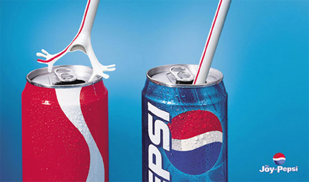
Pepsi advertisement

This pepsi advert is obviously showing the personality of…the straw…not wanting to go inside a coke can, but would happily enter a pepsi can. This advert, although being creative, doesn’t tick the box for me. What I find ironic about this ad (and i’m not sure if this applies to everyone or just people who are observant within branding) is that the coke can isn’t a coke can, but the colour and style is enough for people to recognise it is, which kind of backlashes a little on saying pepsi is better.. but we are adding value to Coke by subcontiously knowing it is Coca Cola without even being told! The most important thing that I notice, and believe it ruins the strategy behind the advert, is that I have a love for Coke as a brand (as im sure most others do) and I think that Pepsi made a mistake in slating one of the most popular and loved brands. Who lets us know it’s Christmas first? Where can we open happiness? I find myself sticking up for Coke undoubtedly and therefore prefer the brand. Whoops!

I found another on my internet travels:BMW v Audi

This. Is. AMAZING. All this takes is a bit of communication and a smart loyal BMW worker (or insider info on where Audi will have billboards!) and, well, it speaks for itself really.

Audi, (as much as I love them) is a tad screwed by BMW (even though I love to hate them*). Fair enough, thy decided to undermine their competition, but they didn’t think of the consequences, let alone have a strong enough advert in order to face upto any challenges! I know it isn’t very common to get adverts like this, but every corner should be covered, especially when you are within a highly competitive market.

The copy in the BMW ad is brilliant. It sums up “We’ve got the best car and you simply cannot beat it”, whilst adding creativity everybody relates to and a touch of witty intelligence from the brand. Audi deserve this bit of a bashing as they know they are within top competition…it’s not like it hadn’t happened before.

IsSeemlessBrandingRelevant?

A brand is a representation of a personality, an experience and quite frankly, profit. If we take some brands for instance, Apple, Heinz, BBC, Loriel, and Virgin. All of these brands do not just focus on one product, they have a range. This range has to have similarities in packaging, logos, names, quality and pricing in order to become ‘seamless’ and spread the brand experience and personality across all its products. In the same way, if we take a sort of ‘product free’ brand such as Google, which provides us with services rather than products, we can still safely say this brand is seamless and probably more so than the others because of the adaptability and creativity the internet can give.

Let’s look at a singular brand. Heinz is something different! I literally just saw an advert on TV which has a series of people blowing on soup and then the end wording read “It has to be Heinz”. It’s true. It has to be Heinz. Not just in the hypothetical sense that it has to be Heinz to get the taste and quality from Heinz, but in the sense of the style of the down to earth simplistic advertising which tells the brands personality so well with no need for silly catchphrases, celebrities and partners in order to support the brand. Another advert like this is the tomato ketchup one, where a man is shaking ketchup out of a bottle but the bottle is invisible (I would link you to these but they aren’t on YouTube! However you can find them on CreativeClub if you have access to it). It is obviously Heinz ketchup, but again the advertising and sense of the brand that the advertisement portrays tells the viewer this probably before it is even shown at the end of the advert. This ‘seamless’ connecting between the two adverts are essential in order to create a strong desire and reminder of the brand.

Now, taking Google like we mentioned before which is a service, the seamlessness can be even more ‘appliable’. How often do we see the logo? How often is it mentioned and is part of people’s lives? If you want to find something out…I’m pretty sure I would “Google it”. Right now I am using the server Google chrome and the logo is this:

and google looks like this:

See the similarity? Now, imagine if the Google chrome logo looked like this:

Or even this?

Would you know it was Google if seeing it? Further still would it change what you think about Google or change your behaviour with the brand? It would me, I definitely know that. It would make me angry that it is so easy and vital to be seamless in order to keep your products alive and keep your customers interested that why would they be so ridiculously stupid not to keep it similar?! Luckily I do not have this anger because they beautifully created a logo recognizable to Google.

This is a rather beautiful quote from Nicholas Ind – “Living the brand is to inspire individuals to identify and internalise the brand; to become committed to delivering value so that customers and consumers can enjoy a seemingly seamless experience that lives up to (and exceeds) their expectations.” Yep, that’s pretty much what I wanted to say.

Enjoy this video once again, to end. It is slightly relevant, but I would like to emphasise the 481,000 views and is the Google brand damaged? Not at all.